My friend who loves food and art was in town visiting this past weekend. She planned the trip a while back and so I was waiting to go see the Whitney Biennial when she was in town. (Being from the lover/collector/seller side of the art world I thought she would provide a good sounding board).
We found our way up to the Whitney in the middle of big thunderstorms that were blowing through the city. That should have been a portent... As we were waiting for the elevator I jokingly said, "What are the chances that this is worse than I am expecting?" I was kidding. Really I was! I thought well, it will be not as bad or just as bad, but there is no way - no way - that it can be worse...
Wanna bet?
It is miles beyond worse than I expected. Even the most excoriating reviews couldn't voice all that is wrong with it, even when it is written in three different parts. It just seems hard to put into words all that is wrong with it. I won't do a deluge of repeating what has already been so eloquently said, my take away was 'a jumble of half formed ideas.' (And even then most of those weren't even well crafted!)
 Just so you know I didn't just make all this up without having seen the show, there were a couple of artists who - given more room - stand out...
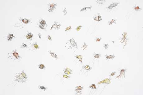
Jennie Smith - delicate and fanciful drawings of creatures (some recognizable, more that are strange amalgams or fantasies) filled with life and energy as they progress across or up the paper.
Florian Maier Achen - large scale chromogenic prints which are manipulated (colorwise). These contemporary landscape photos create a vertiginous sense of scale and depth.
Jordan Wolfson - (many critics didn't like this) the video of the signing of the speech from Charlie Chaplin's The Great Dictator. (Text of the speech). Its a beautiful and emotional speech, which when rendered in sign language by a man whose head is cut off from the viewer, becomes an empty promise (except to the select audience that can read the rapid fire signing). It is a plaintive and silent cry.
Robert Pruitt - his carefully rendered drawings are a powerful commentary on race and social politics.
And that's it. We saw other shows in Chelsea the following day which are far more interesting to comment on, so I will --
I knew I could get some sure fire hits at two of my favorite galleries (Morgan Lehman and Roebling Hall), and while we did visit others along the way, these two did not disappoint!
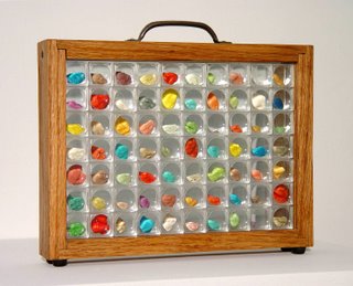 Morgan Lehman was showing the obsessive (you know I like that!) works of John Salvest, which include a large wall installation of business cards which spells out "Remember Me," a first aid kit filled with stacks of pills laid out to form the American flag, and a specimen box of 70 pieces of chewed gum, sorted into little magnifying boxes. I found the work, intriguing and clever, it has the strange aura of collecting the unwanted (and makes me think of the fabled old woman in an apartment with huge piles of books, newspapers and trinkets which fill the space), and comes across also as a fidgeting distraction. By focusing on the mundane, he allows himself to ignore greater issues or interactions.
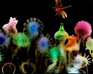 We stopped by to see the Joe Fig show at Plus Ultra that I had already seen, and of course popped into Schroeder Romero to see the group show Double Take - where I was allowed to leaf through Wendy Small's fantastic photograms of ethereal and pulsatingly colorful dream worlds created by condoms. (Which, if you missed my birthday - and clearly you did - you could still pick one of these up for me, since they are being offered at an incredibly good price).
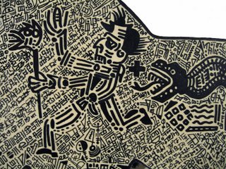
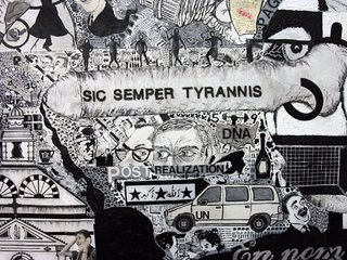 The final stop was the incredibly powerful work of Deborah Grant at Roebling Hall. Ms. Grant is showing "paintings" which are essentially a set of massively detailed ink drawings executed on wood that is cut out in the shape of images from Guernica (the title of the show, "A Gin Cure" is an anagram). The work references all of the aspects of ones life - political, social, religious, - and the works come across as personal and accessible. There is humor, irony, anger and beauty contained within the tiny drawings which cover every inch of the wood pieces. (The picture at the top of the post is from the current show). As my friend remarked after looking at the work "Why isn't this in the Biennial?"
Ms. Grants work (and the show itself) encompassed all of the things that were missing from the Whi Bi - obsessively well crafted, finely honed, politically and socially important, art historically referential, but in an accessible way, and presented in a powerful and enigmatic presentation which allowed the work to really come through in all of its strength.
I just want to state again that the Whi Bi has a great opportunity to return to its roots, to forget about the overarching curatorial voice and really survey the work being done by American artists. Undoubtedly with that kind of survey there will be themes and schools which emerge more, well, naturally. This would provide a far more interesting view of the "American" point of view and the evolution of art movements.


No comments:
Post a Comment